As humans, we are not all the same. There’s no perfect ideal for the human body or mind, and design should acknowledge and address that. Today, most tech products are designed using as reference a fault model of normality, since there’s no standard version for the human experience.
There are several steps you can take to change that and design an inclusive app interface. It can be overwhelming, as the human experience is so diverse. So, let’s start by remembering why we’re doing this. As Dana Kachan writes in her article Design open for all: an overview of inclusive UX Design:
“The designer’s challenge and honorable mission is to create a product accessible to as many people as possible and emphasize their abilities, not limitations. Empower everyone. Don’t make exceptions. (…)We can start building a more inclusive and sustainable future right now. By helping match someone’s limitations with their surroundings for more comprehensive interactivity, we all evolve too.”
So, how can we design an inclusive app interface? Well, let’s start from the basics, shall we?
When we create a tech product considering only our own experience, it might work well for people with similar age, gender, social background, body abilities and preferences than us. However, it might exclude many. Research is important because it places your ideas in the real world. It will support you in understanding what are people’s biggest needs within the segment of your choosing - that can be music streaming or project management - and find a solution that fits most people.
Every application on the App or Play Store now is solving a need or a pain from people - even if it’s one they didn’t know they had in the first place. Research will burst your bubble (in each every one of us lives) and help you find creative solutions that you have not thought about. There are several ways you can conduct research that is mindful of diversity:
Theoretical research
A good way to start your research is to find what other designers, institutions, or companies have learned and shared with the world about creating inclusive apps. Thanks to the World Wide Web we can find many helpful articles and guides. Google made available Designer’s Guide to Accessibility Research, which is a good way to start, together with Apple’s Human Interface Guidelines. You can find more suggestions down below in our references section.
Recruit users
You should be aware of the diversity you want to represent in your app and reach out to people in and out of your social circle. There are many ways you can do that: ask people to use your app and interview them one-on-one or via questionnaires, for instance. If you are in the initial stage of creating an interface, it’s fine as well. Just remember to not be biased and lead people in answering what you want to hear. Focus on people’s needs and listen more than talk. If you are having a hard time finding people to test your product you can contact companies specialized in market research.

Consider the differences of a remote or in-person research
Asking people about how was the experience using your app is very different than being there when they are using it. You will notice what people skip or don’t, how they are holding their phones, if they are going through the path you imagined. Consider if for your product it’s crucial to test it with users in person or not and if so, don’t forget to not interfere on the first time people are testing it. Observe closely and after, talk to them about the experience.
One of the great aspects of tech products is how scalable they are, how they can be accessed in China or Argentina by people of any age, gender or preferences. An application has a universal quality and potential that should not be ignored.
Language
An app’s writing text style and the words you use are crucial to make all users feel seen and to communicate your message successfully. Copy, the writing text part of a product, is an important layer of the interface and it should welcome everyone in participating in the experience of using your app. If you chose academic language in a product that targets people outside of the academic world, then people will feel like that product was not made for them. If you speak native British English and you use idioms that only British people will understand, in an app that is meant to be as universal as possible, then you won’t get your message across. Some things to consider when writing a inclusive copy:
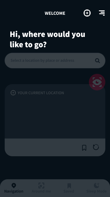
Fonts & typefaces
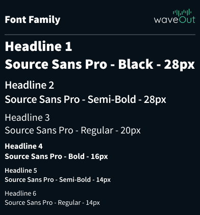
Certain fonts and typefaces are easier to read than others. An accessible font will not exclude nor slow down the reading speed of any user, including those with blindness, vision loss, and reading disorders. The fonts considered the most accessible are:
This fonts are considered to have simpler shapes and patterns, being easier to be analyzed and understood. It’s also important to limit the number of typefaces, fonts and fonts variation. Another things to keep in mind to have better readability and a more inclusive app interface:
Colors and contrast settings
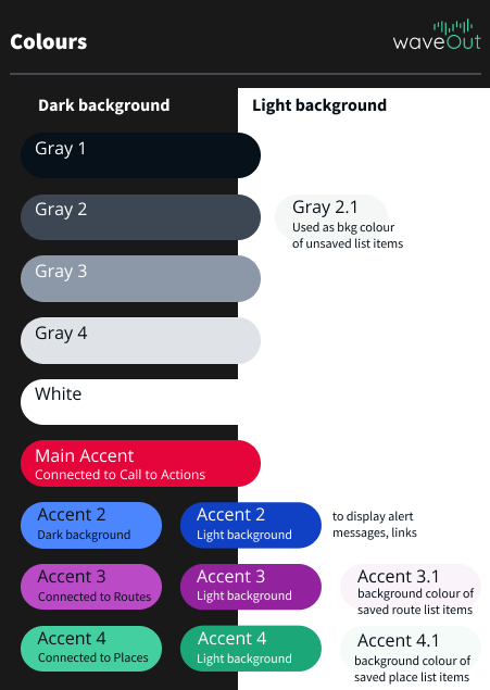
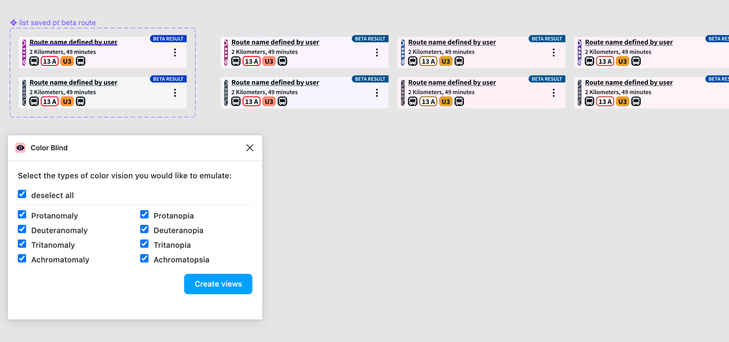
It’s important to remember not everyone experiences colors the same way. Some people have color-blindness or visual impairments. Because of that, you shouldn’t use color as the only visual element to convey information. Instead, use multiple visual cues to communicate important states of your app, such as iconography or text.
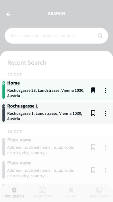
Another important context to take into consideration is the environment, especially for mobile products. People will use your app in different scenarios, such as a sunny day outside, and if your interface does not have sufficient contrast they won’t be able to see it.
“Include design elements to ensure that everyone who uses your app receives the same amount of information, regardless of ability to see or interpret colors. Design for different environments and choose contrast ratio wisely.” Font: Material Design https://material.io/design/usability/accessibility.html
Accessibility
“Inclusiveness is different from accessibility in that inclusivity doesn't specifically address a particular need or problem - rather inclusivity provides a spectrum of tools and features that the end-user can choose from to fit his or her requirements in the given context.” Font: The Inclusive Learning Design Handbook https://handbook.floeproject.org/understandingaccessibilityandinclusivity
To make an accessible tech product, you need to make sure it will support features such as voice commands and screen readers, mostly used by people who are blind or visually impaired, closed captioning, and directional controllers, which allow users to jump between selections linearly.
For those accessibility features to work, your app’s interface needs to take into consideration:
To delve into those concepts, keep reading.
Hierarchy and order
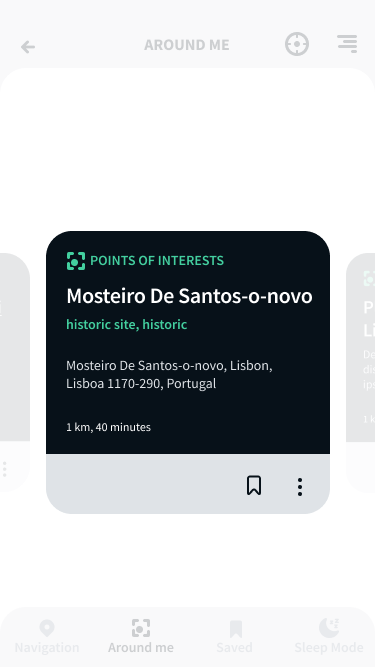
When opening your app, users should know what is important and how to navigate to where they want. Navigation should be simple and with as less steps as possible. The more elements you add, whether it’s a button or an image, it makes your interface more complex. To organize all information, you should have a clear hierarchy:
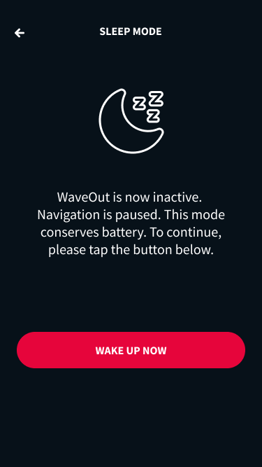

That’s very important for screen readers, for instance. So, when designing an inclusive app interface it’s important to work closely with the developer, and the Material Design Guidelines explains why:
“While CSS determines the layout and appearance of a page, screen readers rely on the top-down structure of HTML on any platform (mobile or web). This structure creates a map for the screen reader to follow when reading the content.” Font: Material Design https://material.io/design/usability/accessibility.html#color-and-contrast
When designing a human-centered interface that is easy to use, you should also determine the interface’s focus points. Focus, as a visual hierarchy, follows the order from the top to the bottom of the screen. You should also take into consideration how content is organized within the same space, grouping elements from the same segment under a heading, for example. Transitions to different screens that are simple to understand and create a fluid experience, without needing to return or repeat an action, are also crucial to creating a continuous interface.
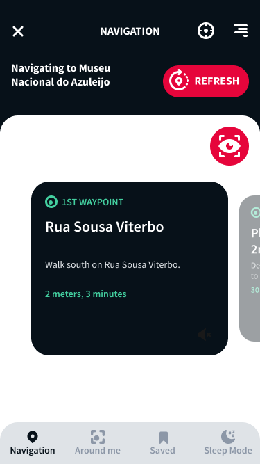
“The premise of inclusive design is that apart from permanent disabilities there are temporary, situational, or changing disabilities that affect us all. We use mobile devices in noisy environments, we struggle with screen glare in sunlight, and we attempt to tap links on touch screens that are positioned too close to each other—all of which leaves us temporarily impaired.” Font: Olivier Lindberg, 12 Ways to Design for Everyone https://www.shopify.com/partners/blog/inclusive-design
An inclusive tech product is a better tech product, and not only because more people will be able to use it. An app with an inclusive interface will be more adaptable to different contexts, life situations, temporary impairments. It won’t let the user down, whoever that user is and whatever moment in time: on a sunny day outside or in the comfort of the sofa. People and environments change, and your app should change with them.
Not to mention everyone has the right to access tech products, and several national laws address that. Inclusivity should be one of your app’s focuses from the initial stages until… forever. The diversity debate it’s alive and it’s a cultural process, always updating. Liliana Calapez, Dreamwaves’s lead designer and creator of the waveOut interface that illustrates this article, focused on inclusion since the first draft of the app, since the first research. Calapez reflects on how it’s important to keep evolving:
“There’s no single solution that will fit everyone, but we can look at the diversity of our user's needs to co-design a product that includes as many people as possible”.
To make sure your app stays relevant, keep in touch with your user, listen to what they have to say. A good way to do that is to include a feedback section on your app, to have empathetic and attentive customer service, and social media channels.
How to Conduct Inclusive UX Research by Vale Querini, available on https://careerfoundry.com/en/blog/ux-design/inclusive-ux-research/
Design open for all: an overview of inclusive UX design by Dana Kachan, available on https://bootcamp.uxdesign.cc/design-open-for-all-an-overview-of-inclusive-ux-design-121fcdea232e
Human Interface Guidelines by Apple, available on https://developer.apple.com/design/human-interface-guidelines/inclusion/overview
How can technology design be made more inclusive? by Aaron Hurst, available on https://www.information-age.com/how-can-technology-design-be-made-more-inclusive-123495650/
Mismatch by Kat Holmes, published by MIT Press: https://mitpress.mit.edu/books/mismatch
olor accessibility: tools and resources to help you design inclusive products by Stephanie Walter, available on https://stephaniewalter.design/blog/color-accessibility-tools-resources-to-design-inclusive-products/
Material Design available on https://material.io/design/
Typefaces and Fonts by Web Accessibility in Mind, available on https://webaim.org/techniques/fonts/
Source Sans Pro: Adobe’s first open source type family by Paul D. Hunt, available on https://blog.typekit.com/2012/08/02/source-sans-pro/